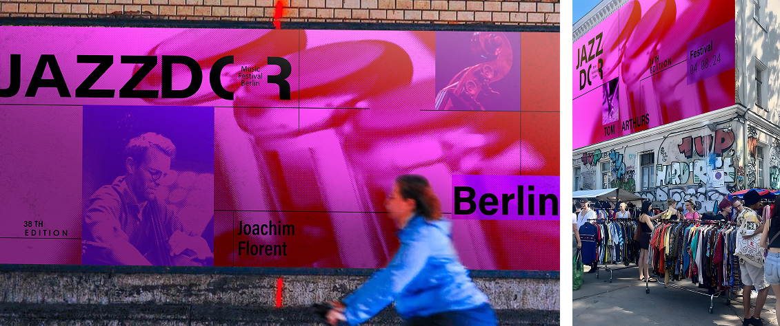
Our team defined a bold design direction for Jazzdor Music Festival, a celebration of contemporary jazz and creative expression. Through extensive visual study, experimentation, and iterative exploration, the festival’s improvisational energy was translated into a structured yet expressive visual language, guided by Dan Friedman’s radical design philosophy. This visual direction was developed for use across the festival's assets and the final microsite.
As lead graphic designer, I drove the visual work and guided our team in shaping a cohesive design system, balancing functionality and expressiveness through key design principles. The resulting design direction captured the energy of jazz culture in Berlin and France, with iterative testing ensuring impact across posters, promotional materials, and contextual mockups.
Jazzdor Festival happens twice a year, promoting diverse forms of jazz. Showcasing diversity and creativity, their mission is to support jazz trends. The festival provides a platform for established and emerging artists, fostering an inclusive environment for jazz enthusiasts.
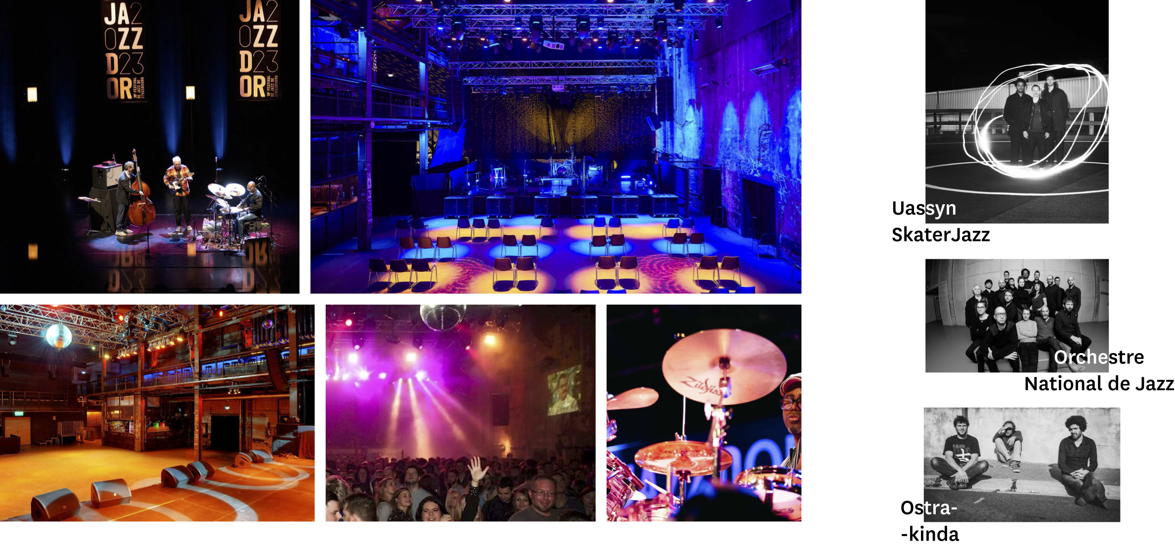
Visual references of the venue, performances, and featured artists were collected to better understand the festival’s atmosphere and audience. These images capture the festival’s energy, colour palette, and spatial environment, providing insights that informed the tone and mood of the design direction.
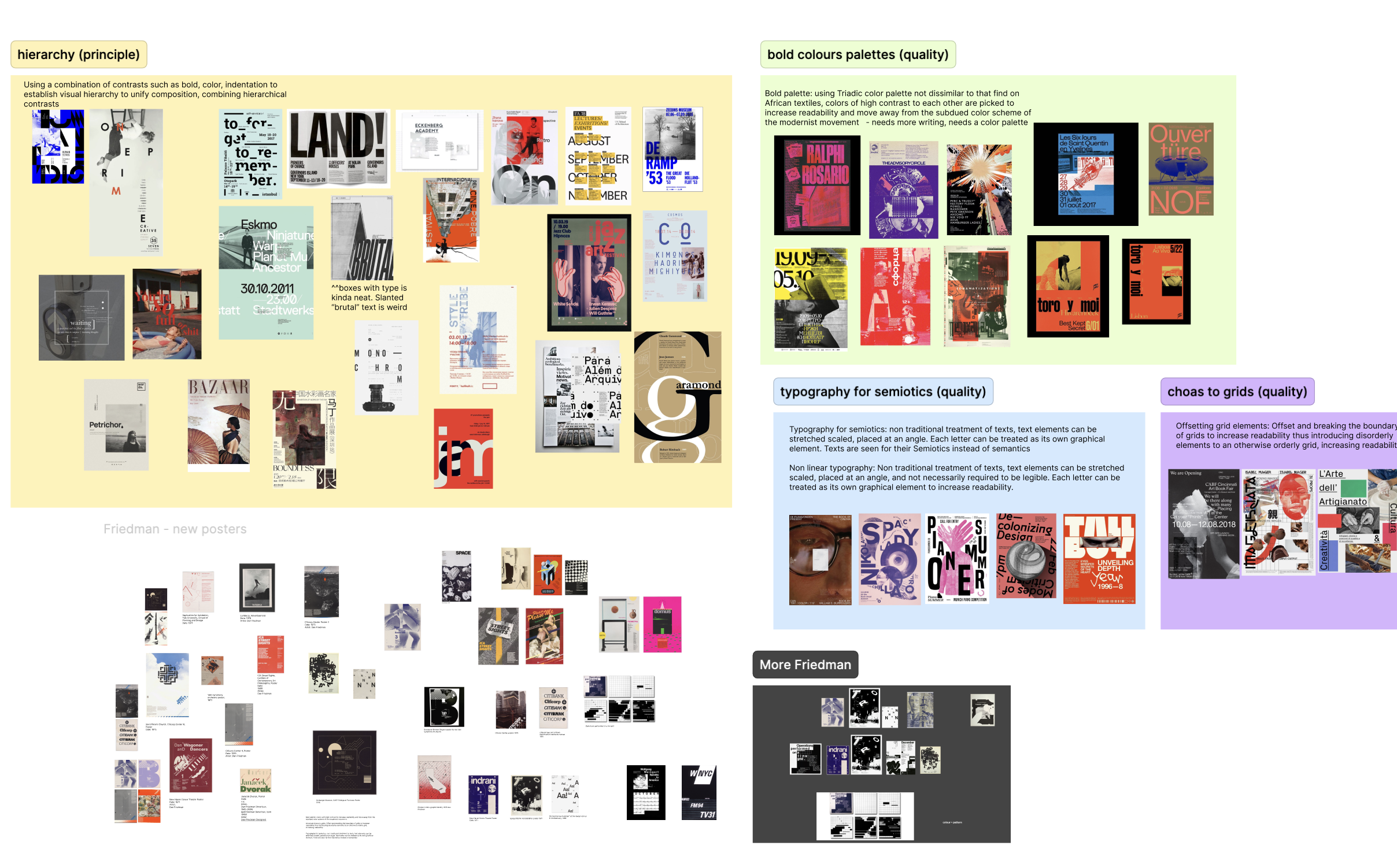
Our team studied the works of Dan Friedman and his design influence in postmodern and radical design movements. We examined his approach to challenge traditional design systems and analyzed other posters that exemplified Friedman’s qualities to to create expressive but structured compositions, balancing experimentation with visual clarity.
Five key design qualities were identified to guide the design direction:
Unconventional treatment of text, to be stretched, scaled, and rotated, treating each letter as its own graphical element to increase readability
Placing text over an image to separate, enhance, and contrast typography from the composition, emphasizing the message and achieving effective visual communication
Offsetting and breaking grid boundaries, introducing disorderly elements into orderly system to increase readability and unpredictability
Applying combinations of elemental contrasts to establish visual hierarchy and unify the composition
Bold, high-contrast colors to enhance readability and stand out from more muted, traditional color schemes
I led the development of the visual direction by defining the mood we wanted to capture, highlighting raw moments of everyday life that convey the richness and energy of Berlin’s jazz and street culture. Throughout the process, we aimed to captivate the audience by expressing jazz in an authentic and dynamic way, avoiding literal and clichéd images. Our team gathered hundreds of photos and organized them into themes like biking, skating, graffiti, and abstract imagery to guide the poster compositions.
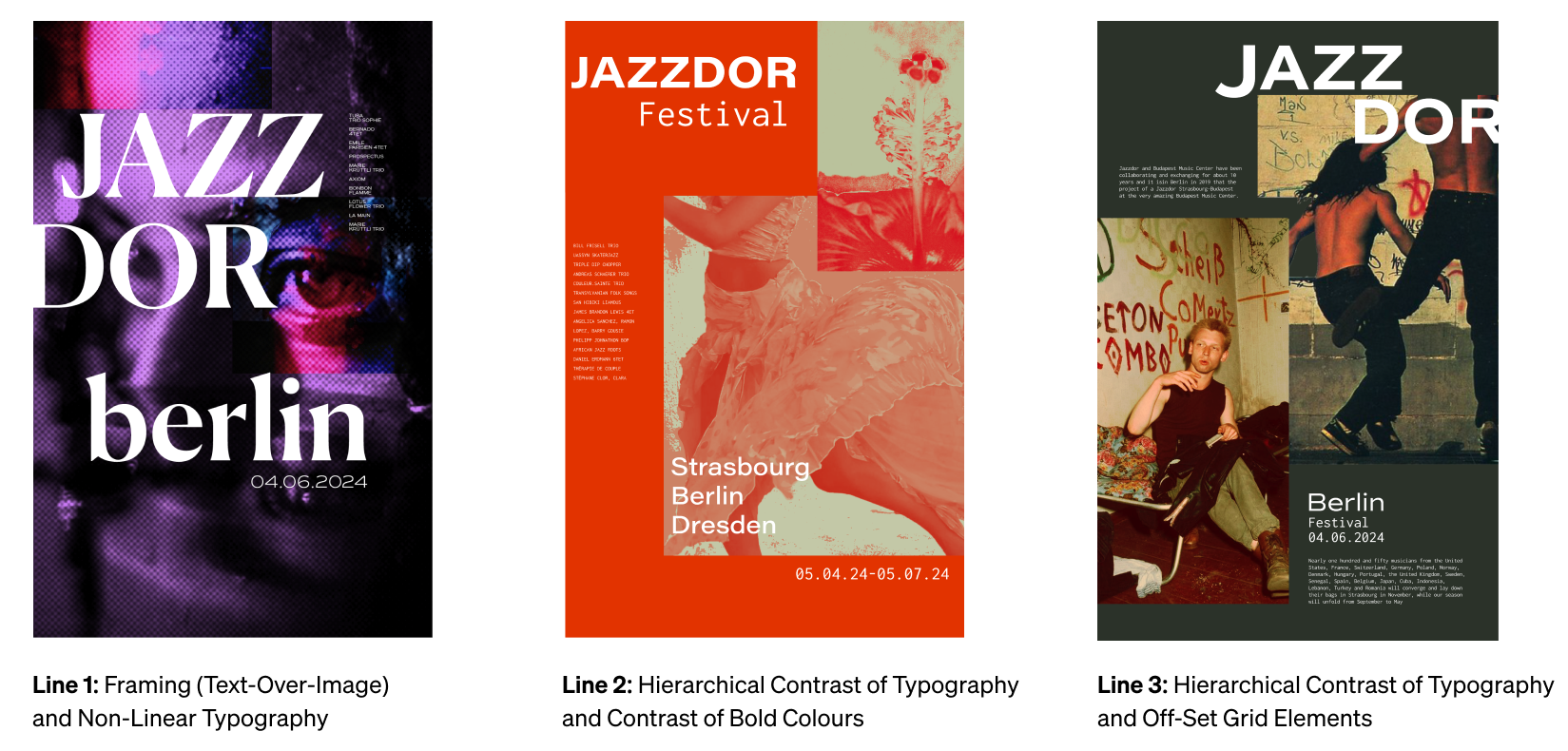
I began experimenting with different ways to combine the design qualities identified during research. Multiple iterations were made for each concept to test how text, imagery, and colour interacted within various layouts. Three lines of investigation emerged from this exploration.
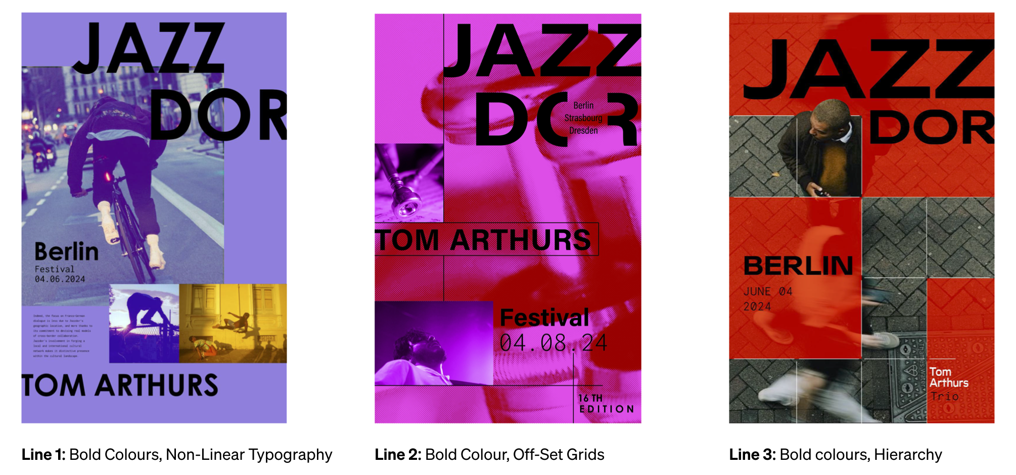
Building on insights from the initial explorations, we used bold colours as a foundation and experimented with different design qualities to see how they interacted with the palette. This stage began as an experimental process, pushing the boundaries of the design qualities, and later shifted to creating cohesive compositions that balanced readability with visual impact, strengthening the relationships between text and imagery to support the overall design focus.
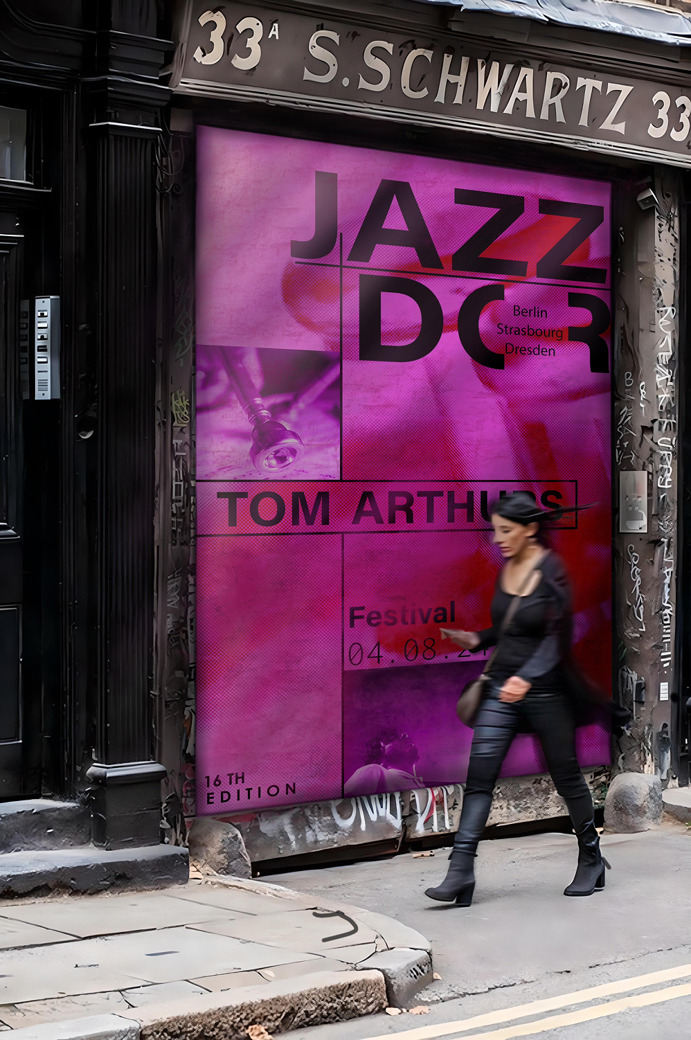
To better understand the effectiveness and impact of the proposed identities, visual mockups were created for each poster using deliberately selected assets that reflected the audience’s environment and experience.
Mockup of line 2 demonstrates the design direction our team moved forward with, adding high visual energy and movement through bold colours and offset grids. A pink base forms the majority of the poster, with tonal variations of purple, accents of bright red, and black to create contrast and visual interest. This combination convey jazz’s creativity and passion while adding energy and movement, reflecting the fesitval's playful and diverse community.
I learned the importance of research and empathy in understanding Jazzdor and its audience. Design involves exploring many directions, iterating, refining, and testing solutions, with ongoing room for reflection and growth. This project gave me the chance to explore ideas and refine my work through a thoughtful process. Every milestone, achievement, and even setbacks helped clarify the overall design vision, ensuring each element was grounded in strong principles rather than driven solely by aesthetics.